Galileo Design System
Building a design system from the ground up we created a democratized design language for Silicon Valley Banks digital experience.

Problem
In 2022, Silicon Valley Bank (SVB) recognized the need for a comprehensive design system to unify its diverse business channels and acquisitions. The initial design, which catered primarily to the Commercial Bank, lacked the flexibility required to meet the nuanced needs of the expanding Private Bank, Securities, and Capital business segments. A central repository for design standards was essential to ensure consistency across UI elements, components, and modules, whether developed internally or by external agencies.
What we found:
-
Conflicting guidelines and directions
-
Duplication of shared components
-
Inconsistencies across brand and marketing assets
-
Pressure for agile solutions without research or discovery
-
Vague module naming and catagorization
-
Isolated teams with fragmented communication
Authors found the legacy design system unclear in the CMS.
Challenge
Fragmented workflows and inconsistent brand experiences have resulted from incomplete website technology and design approaches.
Personal Analysis
SVB collaborates with individuals, investors, and companies in commercial and private banking, understanding their unique business needs and preferences.
Interdepartmental Collaboration
We unified business requirements and functionality into a design system, ensuring consistent user experience across web, app, and marketing channels.
Balanced Innovation
Upgrading a legacy system involved smoothly integrating new design elements and patterns, balancing traditional brand elements with a user-friendly UI in an agile framework.
Accessibility Standards
To comply with accessibility laws, we aimed to create an inclusive design and adhere to AA Web Content Accessibility Standards
(WCAG 2.1).
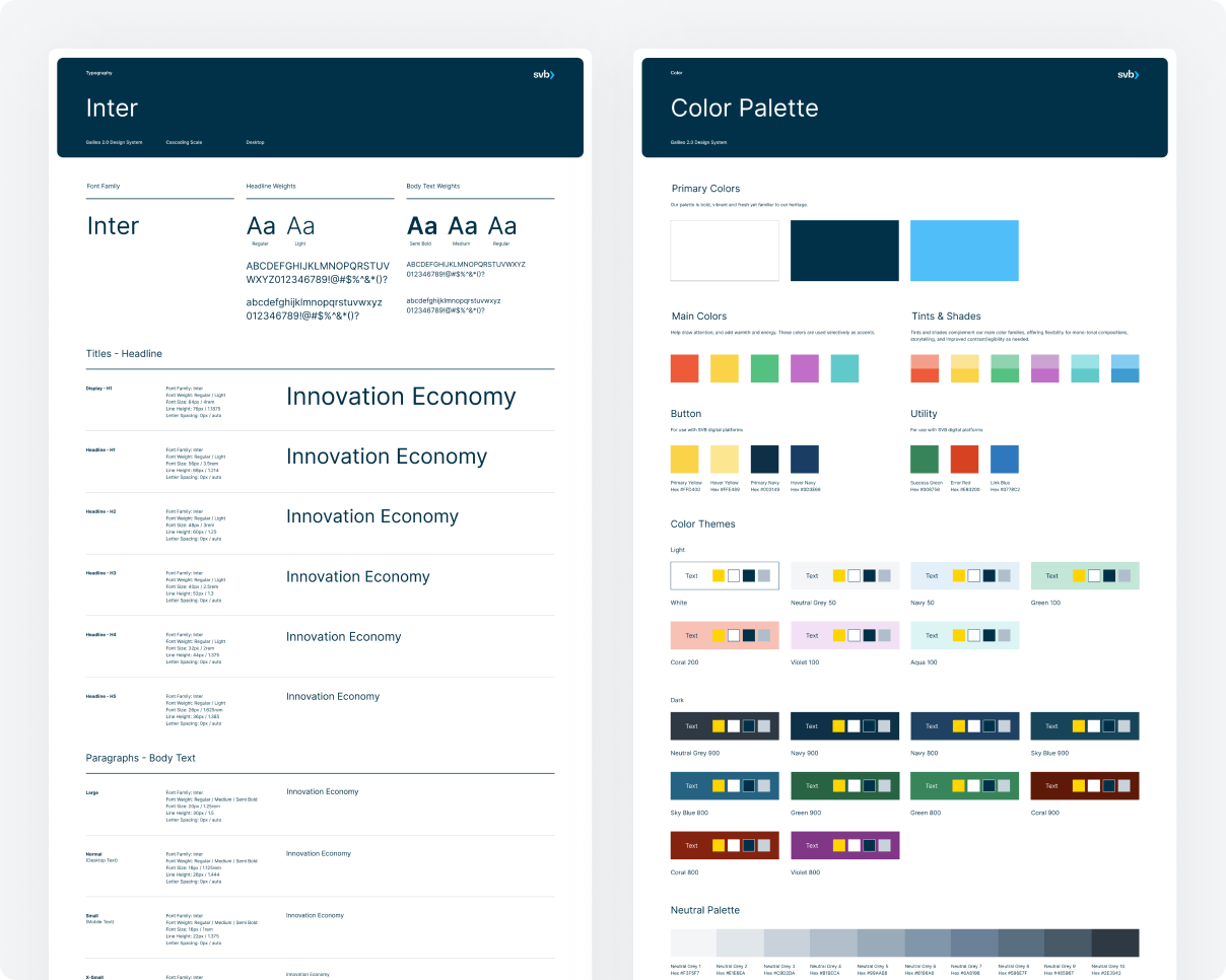
The success of Galileo 2.0 design system hinged on aligning all our teams with the core elements for the brand. Creating one system designed to be adaptable across all business channels, we needed a foundation that could support every conceivable UI element. Setting the foundation upon which Galileo 2.0 was built, our core provided support for grid systems, spacing scales, color schemes, cascading type-scale, icons, logos, and interactive language.
Core


Fig. 1 We implemented a cascading type-scale that incorporates display headings, utility headings, paragraph styles, and supporting styles. Our color scale provides a versatile branded palette with both light and dark themes, while we consistently maintained a universal utility, neutral and color palette across all brands to ensure maximum contrast and accessibility.

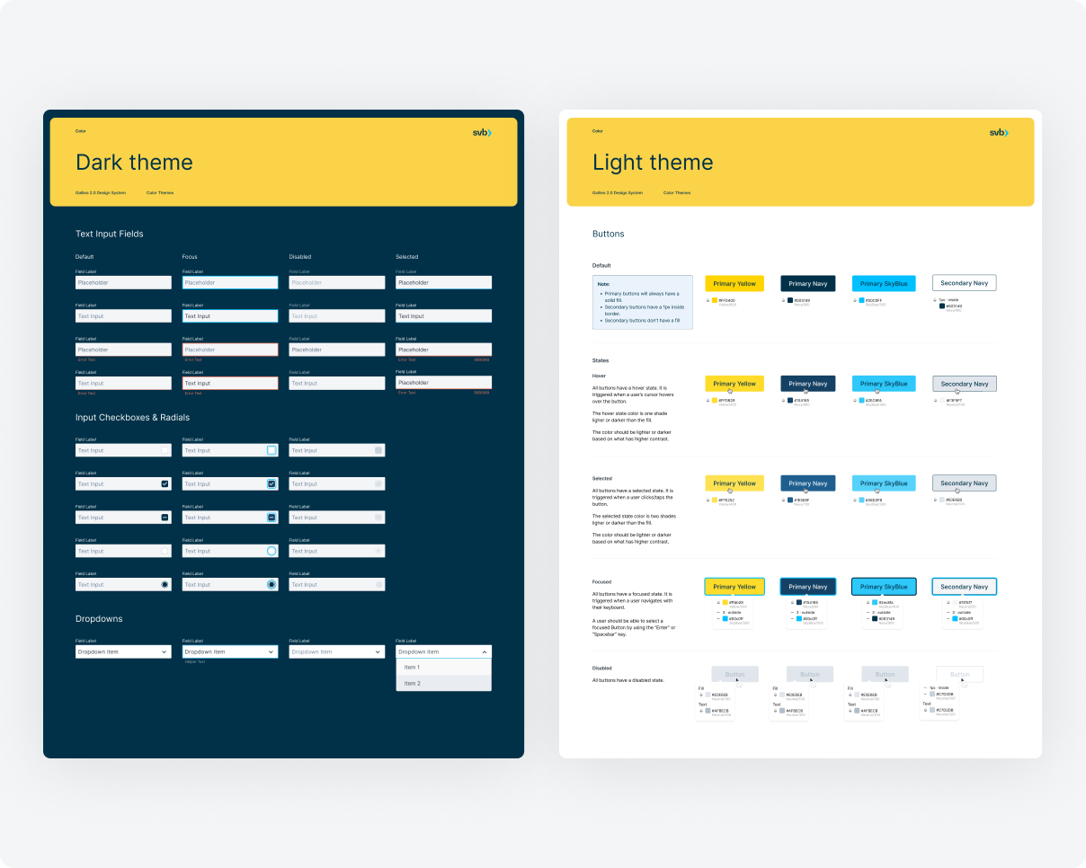
Ensuring design consistency across brands we offered curated options for light and dark color themes for buttons, inputs, and interactions. This flexibility accommodated various background choices while ensuring optimal contrast.
Component Library
We've created a brand-aligned component library for SVB's varied businesses, each identified by unique color themes. This library includes reusable interface elements organized by atomic taxonomy. Our design system utilizes categories like global, structural, content, data, and utility components. Precisely defining these classes is crucial for efficient and accurate design decisions, tailored to each page's context.

Fig. 2 Using Figma we were able to create variations on each component, breakpoint and layout.

We provided stepped interaction examples for each component, clearly communicating expected interactive states. These examples are complemented by detailed specifications covering tab stops, keyboard control requirements, spacing, atom, and molecular elements.

We further refine each component for additional breakpoints and specify minimum and maximum content requirements. This enables content authors to understand the capacity limits for each component.
Pattern
We use patterns to illustrate reusable combinations of components that cater to common user goals through sequences and flows. These were created with our market roll out strategy in mind. While not every conceivable pattern was developed, this documentation forms the foundation for addressing our customers' most frequent requirements.

Accessibility
The utility of any design system hinges on its accessibility. Although this perspective often centers on users, we approached it from a dual standpoint. Our goal was to ensure that we carried all internal teams along this journey by offering clear reasoning, documentation, and education regarding the UX team's work in crafting an accessible system.
Governance
The UX team recognized that effective documentation and governance for integrating the brand into our design language would be pivotal for the system's success and longevity.
Collaborating with our design, content marketers, and development partners, the UX team established and maintained documentation resources within Zeroheight. This effort encompassed our design principles, quick start guides, accessibility standards, design and testing best practices, and brand governance documents tailored to each brand.

Results
The implementation of our design system has yielded significant positive results across multiple areas. This progress underscores the system's effectiveness in improving workflow and user experience.
70%
Adoption and Usage Rate:
70% of designers and developers actively using the design system components before the rollout was paused.
30%
Efficiency Improvements:
Reduced design system modules from 55 to 24, leading to a 30% faster time to market and streamlined CMS processes.
90%
Consistency and Quality:
Improved design consistency reduced errors by 40%, with 90% user satisfaction highlighting a more intuitive experience.


